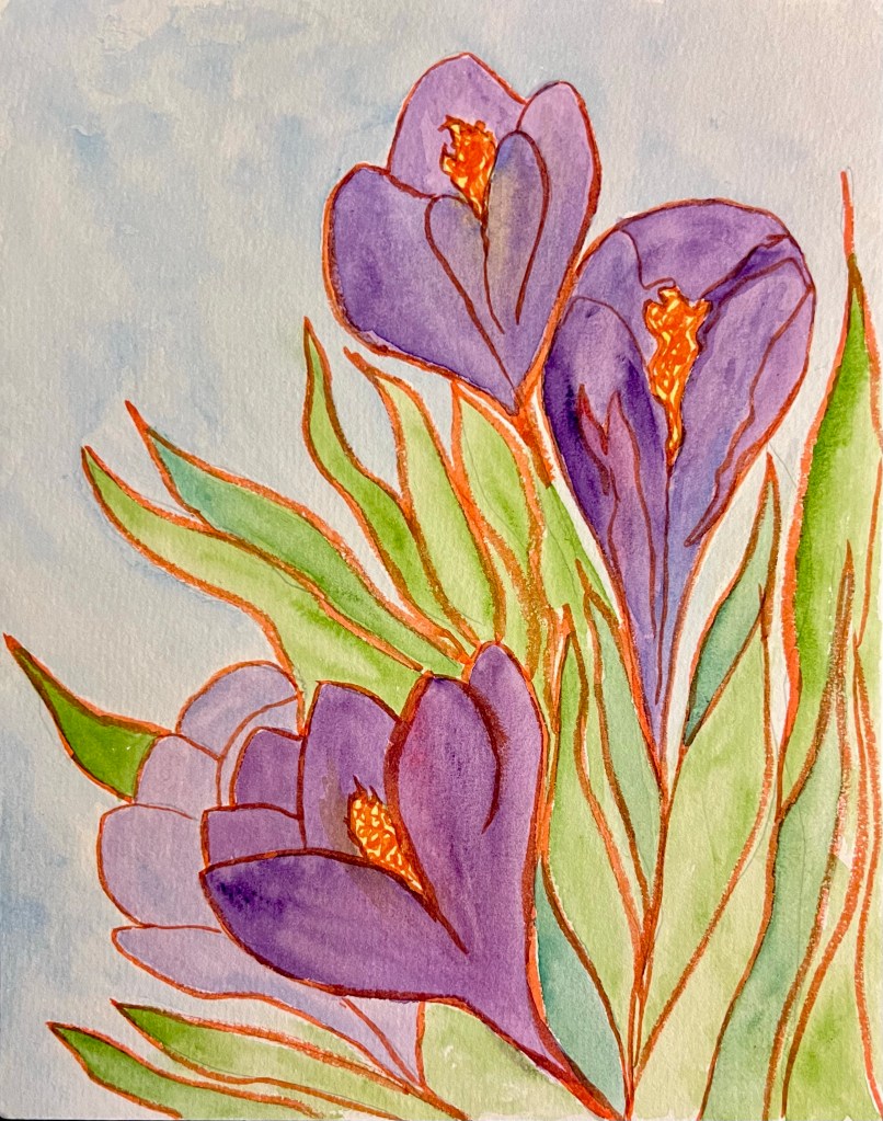
After the Tulip painting I made last week with the orange brush pen ink sketch , I decided I’d like to do more in that style. So today I decided to paint some crocus blooms in that style. My crocuses have bloomed and faded already this spring, so I pulled some pictures up on my phone. I studied them a bit then put them away and did the sketch from my memory of how crocuses look, similar to how I did the tulip painting last week. I’m not trying for realism, but the feelings that these flowers bring out. That’s why I think I love the contrast of the orange ink. Spring blooms are always grabbing my attention and demanding that I take in their beauty. The orange ink draws my eyes with a similar intensity.
Do you like the contrast of the orange with the greens and purples?

Leave a comment